[Note: I’m not very happy with this. It’s been sitting around, in draft form, for more than a week now. Perhaps my mind is simply too preoccupied with my novel and The Strange and Somewhat Sinister Tale of the House at Desert Bridge, but I just can’t turn this into a coherent piece of text. Nevertheless, it’s not doing any good just floating about unfinished, so I’ve decided to publish it now and maybe rework it at a later date. So, when reading, please keep in mind that this is a draft.]
Since a number of people apparently enjoyed my old article about Knowledge and Fear in Metroid II, I decided that it was finally time to write down my thoughts on how the graphics of Metroid II contribute to the scariness.
Now, before we begin, let me make one thing clear: I do not belong to that foolish and wrong-headed group of people who replace an actual opinion or position on artistic matters with nonsensical wankery glorifying their own lack of skill or vision – as in a lot of what passes for modern art, or as in critics who will glorify any crappy old film or book because it’s a “classic” but refuse to recognize that the modern world can produce classics too (Harold Bloom causes intense teeth-grinding in me, but there are worse examples in the world of academe, such as the Frankfurt School of pseudo-Marxist nihilism).
I’m saying all this because I’m about to argue that the graphics of Metroid II are, because of the very limitations of the Game Boy, better than those of Super Metroid, the game that followed it, and I wouldn’t want people to get the wrong impression.
The graphics are obviously just one aspect of what makes the game scary; in fact, it the combination of several factors (design, music, graphics, etc.) that achieves that effect. I will analyze this aspect separately, but the others should be kept in mind.
Metroid II takes places on an alien, inhospitable world. Or at least that’s what it has turned into, especially with the presence of the life-sucking Metroids – we are shown that it once was the home of a now-gone civilization. Although the point of Metroid II is to track down these creatures and kill them, much of the gameplay is actually concerned with exploring the planet.
To me the “feel” of the world in Metroid II is unique, and an important part of what makes the game scary. The graphics, obviously, are limited by what the Game Boy can do – and the game designers have, intentionally or not, turned this to their advantage. According to the Wikipedia‘s technical information the Game Boy featured:
- Color Palette
- 4 shades of “gray” (green to (very) dark blue)
This does not exactly provide for a huge variety of colour. Super Metroid on the SNES, on the other hand, was far more colourful. Just compare these two screenshots:

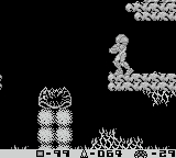
Super Metroid‘s graphics are more detailed and much more colourful. And yet Super Metroid never felt particularly scary to me. Sure, the world is alien, but in a way that is more exotic than threatening. It is, at times, almost pretty. Which is not to say that Super Metroid is a failure – I enjoyed exploring these environments. But judging from the look of large parts of the game, it’s supposed to be scary. Yet even though the design of the monsters is evil and disgusting-looking, the colourful palette makes them less so.
I may be missing the vocabulary to describe this properly.
The thought I’m trying to formulate is that the colours – or rather, the lack thereof – in Metroid II make the game scary because the game looks alien. We’re supposed to imagine planet SR-388 as a deserted and ruined world. The game’s look reinforces that feeling; quite strongly so, in fact. “Less is more” is a stupid phrase, but think of the difference between the film Alien and its third sequel, Alien Resurrection . In the first film, very little can be seen of the monster; in the final one, there are tons upon tons of gooey and gory images. Alien is scary; Alien Resurrection is boring.
But that’s not quite right, either. The difference in the Alien films is how much you leave to the imagination; that’s not what makes Metroid II scary. Perhaps one could say that Super Metroid tries to look more realistic (or at least to present its world in terms closer to our reality), and that makes it – on an almost instinctual level – less scary. Less alien.
I would even say that the blockiness of the graphics in Metroid II, their relatively low detail and the constant repetition of patterns, is an advantage – the game has a look which is both consistent and unique. This is the strength of graphics that do not try to be realistic: instead of simulating something else and failing, they create their own atmosphere. Metroid II does this remarkably well.
To demonstrate: there is an unofficial colour version of Metroid II. It’s well done and it doesn’t look bad, but it looks far more accessible, far more human – and far less scary. Our world is colourful and we can relate to that; it’s the strange greenish desolation of the original game that unnerves us.
I’m a writer, not a graphic artist. I feel that my not knowing the proper terminology (much as in my article about Metroid II’s music) is preventing me from saying what I really want to say, and this is enormously frustrating. Nevertheless, I hope at least a little gets across to you.
In more abstract game design terms, this is another case of having to give a game the kind of visuals that it needs. More, in terms of dimensions and resolution and colour and all that, does not always mean better.